Brand Resources
The Logo
The logo for the Episcopal Diocese of Maine utilizes design elements – namely the pine tree and the cross – that have remained consistent since 1930. The shape of the logo echoes both the diocesan shield and the shield of The Episcopal Church.
We use bright, evocative colors in the logo. Green represents Maine’s forests and state nickname as The Pine Tree State. Violet is the distinctive color of the bishop’s vestments. Harvest orange evokes the beauty of the fall colors in Maine. Finally, blue represents water – the ocean, lakes, and rivers of Maine – and is a reference to the featuring of water in the original diocesan seal.
The “Episcopal Maine” wordmark is used in the logo for simplicity. This is a design choice and the diocesan name remains The Episcopal Diocese of Maine.
The logo is capped by the silhouette of Maine supported by a bar of harvest orange and the year of the diocese’s founding, 1820, is featured below the shield.
Click here to download a high-resolution logo file. Please be sure to read our Brand Standards Guide for information about using the diocesan logo.
The Seal
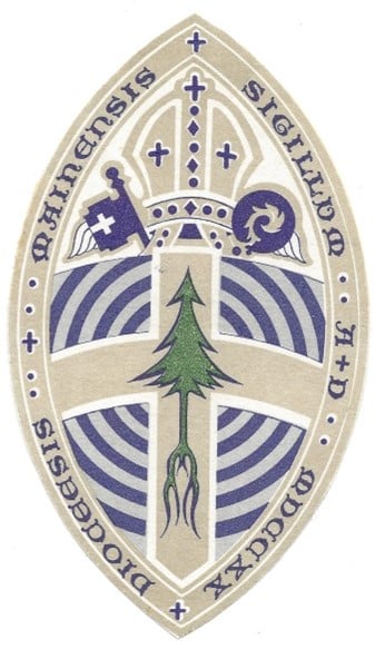
 The seal of the Episcopal Diocese of Maine was adopted at the 1930 Diocesan Convention.
The January 1931 edition of “The North East” reported the action of Convention:
‘In preparing the design for a Diocesan Seal, three objects were kept in view…to present, first, something historical suggestive of the first settlement of the Province of Maine; secondly, to indicate the religious intention of the Seal; and thirdly, to include what would be emblematical of the State.’
The first point is inspired by the arms of the Gorges family, Sir Fernando Gorges having been the proprietor who received the Royal grant of the whole of this region, and who was himself a Churchman. It was on expeditions sent out by him that the first services of the Church of England were held here. His family arms represented a ‘gurge’, a blue spiral on a silver ground, suggesting a fountain or whirlpool, appropriate for Maine with its many rivers, and long indented coastline. For the second point – religion – a plain cross is used. For the third point – Maine’s pine tree is emblematic of the state.
Mr. E. Leander Higgins is credited with bringing these ideas together. Higgins was a Portland architect who designed St Peter’s in Portland, the second St. Thomas’ in Camden, and the first Good Shepherd in Rangeley. The preparing of the design of the Diocesan Seal is credited to Dr. Harold Bowditch of Boston, an accredited expert in the field of heraldry.
The Seal’s use is limited to official documents and is the basis for the Diocesan Seal ring worn by the bishop.
The Shield
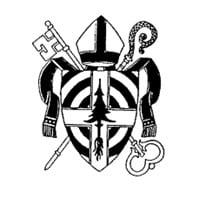
 The shield is a version of the diocesan seal, utilizing the inside of the diocesan seal. The shield is seen as more of a Bishop’s Seal because it pulls the bishop’s mitre and crozier into greater prominence. According to notes from the diocesan archives: “The blue concentric rings represent water and tie the seal to the first service of the Church of England on or near Monhegan Island in 1607, and the uprooted tree represents the…Monhegan Colony.”
The Shield’s use is limited to some official regalia and a slight variation of the shield was used for printed materials for the consecration of the tenth bishop of Maine, Thomas J. Brown.